
The Enthusiasm of Jonathan Glancey
Here’s someone who bursts on to your screen, words tumbling out of his mouth. Enthusiasm is his trademark. Meet Jonathan Glancey, co-author of our autumn double-header Logomotive. Leaping on to the footplate with his fellow logo spotter Ian Logan, he transports you back to the mid-century heyday of American style.
Logomotive: Railroad Graphics and the American Dream is a road and rail trip back to mid-century America, when cars had fins and locomotives were designed to look like planes. The dashing Ian Logan, who made his name designing fabrics for Mary Quant and Jeff Banks, got hooked on railroad logos on his first trip to America. Graphics became his secret romance. In the 1960s and 1970s he returned time after time, photographing logos on the sides of trains and buying old timetables and other ephemera in antique shops.
The story behind the logos
We asked Jonathan Glancey to look behind the logos and slogans collected by his co-author and tell the story of the companies that commissioned them. ‘Every logo tells a story,’ he says. ‘Behind the logo lies the loco, the cars, the freight yards. It’s the whole story of design, not just the logos.’ And that is what he presents in Logomotive. The enthusiasm of Jonathan Glancey shines through all six chapters. In a warm and perceptive analysis, he shows how every aspect of the railways, from the locomotives and rolling stock to architecture, advertisements and timetables, was designed to project an image of speed, efficiency, adventure and the American dream.
With superb economy of language and a natty turn of phrase, he has created a thumbnail history showing how the railways bound this vast country in bands of burnished steel and made it the world’s greatest industrial power.
Cars, planes, trains and buildings
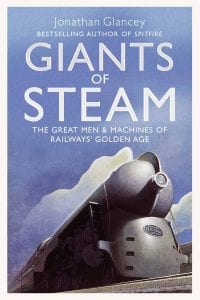
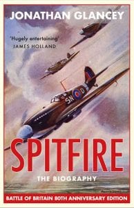
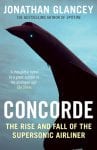
In addition to architecture, his first subject as a journalist, Jonathan Glancey relishes every source of motive power and the way it is designed. His love of trains began in childhood as he pored over picture books on rainy days and led him to drive an Indian Railways Pacific steam locomotive from Delhi to Chandigarh. He has been a pilot since his early 20s. Apart from books on Modern Architecture and What’s So Great about the Eiffel Tower? he has written on the Spitfire, Concorde and the Harrier, The Train, Giants of Steam and Tornado. The enthusiasm of Jonathan Glancey pulses through them all. On television he has presented Small Railway Journeys, Design Icons and pops up as a design critic on just about every design- or engineering-based show, talking about the Severn Bridge, interviewing Renzo Piano, discussing the design of the new Routemaster bus.
The enthusiasm of Jonathan Glancey
Enthusiasm for design runs through the whole of Jonathan Glancey’s career. ‘I want you to write your enthusiasms,’ said Andreas Whittam Smith, Editor of The Independent when Jonathan Glancey joined the paper back in 1986. Glancey did exactly that, writing about the
best and worst of modern architecture, never mincing his words. Going on to become Architecture and Design Correspondent of The Guardian for 15 years, he incited angry ‘phone calls from No. 10 when he blasted the banality of the Millennium Dome.
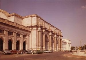
In Logomotive he extols the best of railway architecture in the States, quoting Daniel Burnham, architect of the mighty Union Station in Washington, DC, who wrote: ‘Make no little plans. They have no magic to stir men’s blood.’ This whole book is full of magic, from the motive power of great muscle machines to the untrammelled confidence of pioneering railway barons and the boldness of their advertising. Writing as fast as he speaks, Glancey creates prose with momentum, spices it with vivid mental pictures and percussively drives home his enthusiasms.
An American road and rail trip
If you like the sound of this logo-spotting odyssey and all-American success story from the streamline era, the details are here.
If Glancey’s enthusiasm has got to you, you can order Logomotive now.