Independent Publishers
In this promotional graphic, vintage postcards display a collage of brightly coloured American railroad timetables dating from the 1930s to the 1960s and announce a book-and-cards to mark America’s 250th year.
Ian Logan’s book Logomotive lies on an array of postcards created from period photographs and ephemera.
In this colour photograph of Ian Logan’s book Logomotive open at the title page, his photograph of a Missouri Pacific eagle logo is the frontispiece, painted in white on the side of a diesel locomotive. The pages have a black background with the title and byline dropped out in white.
In this colour photograph taken in the 1970s by Ian Logan, author of Logomotive, a Southern Pacific GP 30 diesel locomotive draws a long train of boxcars and flat cars up a pass in the New Mexico desert, with two additional locomotives providing power immediately behind. and telegraph poles following the track. The company’s SP logo is picked out in white against the company’s ‘bloody nose’ livery.
This colour image shows five railway-themed postcards on a green background arranged in a fan from top right to bottom left.
In this double-page spread from Logomotive by Ian Logan and Jonathan Glancey, a dozen logos of American railroads of varying sizes recall their regional origins in places like Boston, Western Maryland, Louisville & Nashville, Richmond, Fredericksburg and Potomac, picked out in bold colours and stylized graphics.
Logomotive open beside a mug of coffee, displaying a double-page spread on the Lackawanna Railroad and its fictional heroine Phoebe Snow.
In this black-and-white image of the back of the card, the words Post Card appear in an open-face font. A vertical dividing line of small type identifies the publisher. The right half of the card has a space for the stamp and five lines for the address. The left half carries a small caption at the bottom identifying the source of the image on the front.
    “A visual tribute to the heyday of railroad graphics and design.”
    The Ephemera Society
    “A prestige book by a leading graphic designer and a popular railway writer.”
    Roger Backhouse, National Railway Museum Review
    “It is fantastic – my personal fave book of the year. I just love it.”
    Nick Smith, E&T Magazine
    “Reminders of lavish, optimistic, world-beating long-distance trains from another, pre-Amtrak age.”
    Tim Dunn, presenter of The Architecture the Railways Built
    “Ian Logan and Jonathan Glancey are to be congratulated for assembling such a rich collection of images with a strong narrative that captures the spirit of an age and its boundless confidence.”
    Norman Foster

    Designing America: 250 Years in the Making

    Mark the Moment with a Luxury Art Book and a Gift of Cards

    By Ian Logan & Jonathan Glancey, Foreword by Norman Foster

    Original price was: £40.50.Current price is: £24.50.

    To mark America’s 250th year, we have created a commemorative book-and-cards set that takes you on a colourful journey through the history of the United States and gives you a pack of limited-run postcards that you can send to your friends. Order here to get 30% off the book plus five free postcards. Postage and packing are on us. The book sells at £35.00 and the postcards are £5.50, but until 31st July you get both for just £24.50, including delivery. If you are in America, please order from our US website.


    Free delivery on orders over £20
    Dispatched next day with Royal Mail 2nd Class
    Details

      BOOK

    • RRP: £35.00
    • Format: 187 x 264 mm (7 2/5 x 10 2/5 in) landscape
    • Pages: 272
    • Weight: 1.3 kg (2.9 lb)
    • Pictures: 400 in colour
    • Binding: Hardcover no jacket
    • ISBN: 978 1 873329 50 4
    • Publication: October 2020

    POSTCARDS

    • RRP: £5.50
    • Format: 106 mm x 142 mm (4 1/5 x 5 3/5 in ) landscape
    • Paper: 320 gsm Omnia Natural
    • Weight: 31.25 g (1 oz)
    • ISBN: 978 1 873329 66 5
    • Publication: October 2022


    Description

    A Bit about Big Boy 4014

    In the year of the US semiquincentennial, Union Pacific Big Boy 4014, the world’s largest and most powerful steam locomotive, is making is first-ever coast-to-coast journey, arriving in Philadelphia in time for a historic Fourth of July celebration. Saved from the scrapyard in 1961, and left on static display at the Railgiants Train Museum in California for more than 50 years, it was reacquired by Union Pacific in 2013 and restored to active service in time for the 150th anniversary of the transcontinental railroad in 2019. People said it could never be done, but working against the clock, the Union Pacific Steam Team proved them wrong. It was a historic engineering achievement combining 1940s technology with 21st-century computer-aided design.

    How We Got Hooked

    Big Boy’s return to steam coincided with the final editing of our book Logomotive, which tells how the railroads united the states and pioneered the marketing techniques of the modern commercial world. We watched in awe as the engineer Ed Dickens coaxed the giant machine back to life and tried the whistle for the first time – just a husky groan before the full steam pressure of 300 psi was reached, but utterly mesmerizing. When the restored Big Boy arrived in Los Angeles, the co-author of Logomotive, the life-long rail enthusiast Ian Logan, went to see it and captured some memorable close-up photos. And just before Logomotive went to press, we managed to include a wonderful shot by Mike Raia of the locomotive pulling a train under full power to open the last chapter of the book, Phoenix Arising.

    Design Classic

    To celebrate Big Boy’s imminent arrival in Philadelphia we have put together a commemorative book-and-cards set which is now available to order. It includes a copy of Logomotive and a set of vintage postcards created from Ian Logan’s archive of Kodachrome slides and printed ephemera. You get a luxury art book that tells the story of the American railroads in six colourful chapters and ready-to-use historical artefacts that transport you back to the last days of steam.

    Logomotive is written by the eminent design journalist, author and broadcaster Jonathan Glancey, with photographs and artefacts from the archive of celebrated London designer Ian Logan, and has a stirring Foreword by the world-renowned architect Norman Foster, designer of The Gherkin, the Great Court at the British Museum and railway stations around the world.

    The vintage postcards that come with the book are available exclusively from our website. They are not in the shops. Only 1,600 have been printed. If you bought the book and cards at the recommended retail price, you would be paying £40.50. While Big Boy 4014 is on its AMERICA 250 tour, you get both for £24.50, a saving of £16.00. The offer expires when the locomotive returns to its base in Cheyenne on 31st July.

    Railroad Graphics and the American Dream

    ‘We were chatting to some guys in a bar,’ recalls Ian Logan, ‘when the glasses started to rattle on the table and I heard a train approaching.’ He rushed out to see the train coming down the middle of the street. For Ian, on his first trip to the United States, this was the start of a lifelong graphic romance. One of the wagons was painted with a big circle with a heart in the middle and the slogan, Through the Heart of the South. ‘What a logo! I’d never seen anything like it.’

    In that moment Ian Logan became a logo spotter. During the 1960s and 1970s he made numerous return trips photographing the bold, energetic railroad graphics he found painted on locomotives, wagons and guard’s vans. His 35 mm transparencies are now a valuable historical archive. Over the years he has built up a collection of related magazines and newspapers, letterheads, timetables, brochures, matchbooks, ashtrays, badges, posters and postcards. Together they form a visual feast, a salute in his own words to ‘the most exciting collection of graphic imagery ever to have been produced in this field anywhere in the world’.

    A celebration of marketing magic

    To this cornucopia of vintage railroad graphics, the distinguished design commentator Jonathan Glancey – another lifelong railway enthusiast – brings a well-informed, perceptive analysis of its iconography, of the way every aspect of the railroads, from the locomotives and rolling stock to architecture, advertisements and timetables, was designed to project an image of speed, efficiency, adventure and the American dream.

    In his Foreword, the internationally known architect Norman Foster adds his own trumpet call, reminding us of the enduring inspiration provided by this ‘ultimate marriage of machinery, branding, graphics, colour and lifestyle’.

    Designed with energy and flair, and generously laid out with more than 400 illustrations, many published here for the first time, Logomotive will appeal to both railway enthusiasts and to all those who love that blend of technology and art, grease and adventure that pulses through a period of hectic innovation. It offers a unique glimpse into the past, a rare archive of a railroad graphics, preserved on film and paper thanks to Logan’s infectious enthusiasm.

    Contents

    FOREWORD BY NORMAN FOSTER

    PREFACE: Ian Logan on his love for US railroads

    CHAPTER 1: CONQUERING THE CONTINENT
    How railroads reached all corners of the continent; transcontinental lines; infrastructure and rolling stock.
    Setting a Style
    Overland Brands
    Spirit of the Union
    Romance of the Southwest
    Mountain Mascot
    A Mighty Good Road
    Across the Divide
    Southern Blues
    Multiple Identities

    CHAPTER 2: A SENSE OF PLACE
    Regional and local networks, and how they ran across one another’s lines.
    Pride in Their Roots
    Maritime and Coastal
    Chicago and the Lakes
    Southern Connections
    Commuter Lines

    CHAPTER 3: ARRIVALS AND DEPARTURES
    The city as railroad hub: stations, freight yards and transfers.
    Architectural Logos
    Station Design
    Romanesque Revival
    New Deal Deco
    Spanish Mission Style
    Carrying the Message

    CHAPTER 4: SELLING THE DREAM
    How the railroads built customer loyalty through advertising campaigns, slogans, nicknames and branding.
    The Soft Sell
    Nicknames
    Slogans
    Native American Imagery
    Logo Evolution
    Union Pacific
    New York Central and Pennsylvania Railroads
    The On-Board Experience

    CHAPTER 5: STREAMLINE STYLE
    The influence of European Modernism and sleek Art Deco styling; innovative railroad design from the 1930s to 1950s.
    Shooting Stars
    Eagles
    Zephyrs
    Hiawathas
    The Aerotrain
    Interiors
    Art Deco Typography
    On the Road

    CHAPTER 6: PHOENIX ARISING
    The switch from steam to diesel in the mid-20th century; the decline of passenger travel leading to amalgamations and Amtrak-operated services in the 1970s; the revival of restored steam locomotives on scenic routes.
    Rust to Rust
    Romance Revived
    Heritage Line Logos
    New Identities
    Logo Revolution
    New Haven
    Canadian National
    I Love G&W
    Business Attire
    Flying the Flag

    FRONT-WINDOW VIEW
    A Journey with Ian Logan on the Union Pacific
    Railroad Patches

    A RAILROAD GLOSSARY

    RAILROAD NAMES, ABBREVIATIONS AND NICKNAMES

    SELECT BIBLIOGRAPHY

    ACKNOWLEDGEMENTS

    PICTURE CREDITS

    INDEX

    Authors

    Ian Logan was at the centre of the design revolution that marked the end of post-war austerity. He studied at the Central School of Art and Design in London (now Central St. Martin’s), and won a scholarship to the Konstfack, Stockholm’s University of Arts, Crafts and Design. In the early 1960s he joined JRM Design, a fabric print company set up by a group of Central graduates in an almost derelict building in London’s East End. Ian and his partners produced prints for up-and-coming fashion designers such as Mary Quant and Jeff Banks, and designed a tin tray with a Middle Eastern-inspired motif that became enormously successful, first in Carnaby Street and then all over the UK.

    Ian’s passion for vintage railroad Americana was rooted in a Fifties and Sixties childhood attuned to the sounds of folk, skiffle and blues under the influence of his uncle, Ewan MacColl. It was hearing Lonnie Donegan’s hit ‘Rock Island Line’ on the radio in 1961 that inspired Ian to pack up and go to America to see the names, the places and the trains for himself.

    In the mid-1970s he set off in a new direction. Inspired by decorative Victorian tin boxes, he produced a range of tins for Harrods, Fortnum & Mason, Whittard of Chelsea and the National Trust. Commissions came from France, the Netherlands and the United States, for which he developed the Americana range featuring diners, gasoline stations and collectable cars. His money boxes in the form of the iconic red British telephone kiosk became known all over the world.

    The journalist, author and broadcaster Jonathan Glancey is a trailblazing commentator on architecture and design, writing about buildings, cars, planes and trains with deep knowledge and infectious enthusiasm. The architecture and design editor of The Guardian from 1997 to 2012, he now reports on those topics for the website BBC Culture and newspapers and magazines worldwide.

    His obsession with trains began in childhood as he pored over picture books on rainy days, and eventually led him to drive an Indian Railways WP-class Pacific steam locomotive from Delhi to Chandigarh. It has inspired four books, The Train: A Photographic History (2004), John Betjeman on Trains (2006), Tornado: 21st Century Steam (2010) and Giants of Steam (2012), in addition to the Channel 4 mini-series Small Railway Journeys (2006).

    His other books include Twentieth Century Architecture (1998), Lost Buildings (2008), Nagaland: A Journey to India’s Forgotten Frontier (2011) and What’s So Great About the Eiffel Tower? (2017). He has written and presented numerous TV documentaries including, for the BBC, The Genius of Design (2010), Design Icons (2016) and Concorde: A Supersonic Story (2017).

    Norman Foster, Baron Foster of Thames Bank, Kt, OM, RA, is an internationally renowned architect whose buildings include the Hearst Headquarters in New York, the Museum of Fine Arts, Boston, the Swiss Re ‘Gherkin’ in London and the Reichstag dome in Berlin. His passion for railways goes back to childhood, when he would watch trains passing his home in Manchester. He has undertaken several major railroad projects, including the Florence High Speed Station in Italy and four stations for the Haramain High Speed Rail in Saudi Arabia.

    Preview

    FOREWORD BY NORMAN FOSTER
    Logomotive touches on so many of my personal interests and in the ways they connect, particularly the age of streamlining, which ushered in the new era of lightweight, stainless steel post-steam expresses like the Burlington Zephyr built by Budd of Philadelphia and Union Pacific M10000. Budd also pressed body panels for the revolutionary Chrysler Airflow automobile of the same period. In promotional photo shoots, the Airflow appears alongside the M10000. Significantly, both are also visually linked to the Art Deco detailing of the New York Chrysler Building – all born in the early 1930s.

    FROM CHAPTER 3: ARRIVALS AND DEPARTURES
    An epiphany of clanging bells, chiming whistles, baritone hooters and the percussive ministry of air-brake pumps announced the arrival of generations of trains at railroad stations across the United States. It was as if religious processions were coming to town. And, in a sense, they were. For the American railroad station or depot was, as medieval parish churches had been in Europe, the ritualistic hub around which life turned, especially in remote settlements.

    As trains drew in, stations burst into life. Station wagons, horse powered before 1900, met passengers and their luggage bound for hotels. The station telegraph would be busy with reports on the line ahead and messages to and from passengers and their points of departure. Freight and baggage were manhandled in and out of boxcars and cabooses…

    Station styles

    By 1900, American passengers might find themselves boarding or alighting trains at stations designed in the guise of Romanesque abbey churches, Greek temples, imperial Roman baths, Gothic cathedrals, medieval cloth halls, Italianate palazzi, French chateaux, Black Forest gingerbread houses, Spanish missions and homespun farmsteads. Through this encyclopedia of styles, US railways expressed their values and ambitions. Station design could also be a reflection of local architectural character. Daniel Burnham’s mighty Union Station in Washington DC, opened in 1907, is an equal match for the Neoclassical civic temples and monuments lining the city’s Mall.

    Classical allusions

    For many Americans, the architecture of ancient Greece and Rome embodied republican and democratic virtues. Commanding a vista of streets and avenues fanning out from Columbus Circle, Union Station is fronted by a giant reiteration of the Arch of Constantine. Through this Neo-Roman portal as many as 200,000 passengers a day have flocked into the Great Hall behind it, the imperious design of which is based on the Baths of Diocletian. ‘Make no little plans,’ Burnham said. ‘They have no magic to stir men’s blood.’

    FROM CHAPTER 1: CONQUERING THE CONTINENT
    The 1881 Trademark Act made a significant visual impact on US railroads as draughtsmen got to work on new insignia. That same year the Chicago, Burlington & Quincy registered the first railroad trademark, a distinctive rectangle enclosing the legend ‘Burlington Route’ created by Daniel Lord of the pioneering Chicago advertising agency Lord & Thomas. Lord’s logo stayed firmly in place on Burlington Route trains until the Chicago, Burlington & Quincy merged with three other railroads in 1970 to form the Burlington Northern.

    Choose a memorable logo

    Also in 1881 the Union Pacific abandoned its antique-looking mountain elk symbol that might have belonged to any number of western railroads in favour of a distinctive shield design invented by its passenger agent Edward L. Lomax. With a number of subtle changes – among them the adoption of the colours of the US flag in 1888 and Futura-style lettering in the 1940s – this has stayed much the same ever since. Lomax said that it took him a year and a hundred sketches to find the exact right design.

    By 1883, the Pennsylvania Railroad had begun using its famous and long-lived keystone emblem, a visual reference to the state’s nickname The Keystone State. By this time, the Pennsy was not just the largest US railroad, but the world’s biggest corporation. The Baltimore & Ohio offered a white-on-blue image of the dome of the US Capitol entwined with the letters B and O encircled by the legend All Trains Run Via Washington.

    The Santa Fe’s cross-in-a-circle logo, allegedly created in 1880 by J. J. Byrne, the railway’s traffic manager, toying creatively with a pen and a silver dollar, was adopted in 1901, while the Great Northern’s Rocky Mountain goat trademark leapt from the mind of the railroad’s then Vice President W. P. Kenney in 1921. The Great Northern had played a key role in founding the Glacier National Park, where Rocky Mountain goats were a familiar sight. The beaver pelt trademark of the Rock Island – Chicago, Rock Island & Pacific Railroad – emerged in adverts in 1900 and had been refined into a well-known and enduring logo within five years.

    Use your trademark

    As early as 1890 Edward O. McCormick, general passenger agent of the Big Four system – the Cleveland, Cincinnati, Chicago & St. Louis Railway formed from a merger of four railroads in 1889 – gave a talk on railway advertising. ‘Have a trade mark and use it,’ he said. ‘Use it every-where . . . put it on your freight cars and plaster it wherever you can. People will unconsciously learn it, and will recognise it wherever it may be.’

    FROM CHAPTER 5: STREAMLINE STYLE
    What these German, British and American trains had in common, whether steam or diesel, was a fresh look that manifested itself in bright new colour schemes, the latest in exterior styling and interior design, up-to-the-minute graphics, badges and logos, underpinned by decidedly modern advertising and marketing campaigns that helped sear their image into the popular imagination.
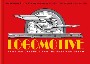
    Gods and goddesses

    The Burlington Zephyrs were the product of the research and imaginative skills of the aeronautical engineer Albert Dean, the advanced welding techniques of Edward Budd, the design flair of architects Paul Philippe Cret and John Harbeson and the vision of Burlington’s dynamic president, Ralph Budd. Wanting his streamliners to be the last word in contemporary railroad design, he decided their name had to begin with Z. By chance, Budd had been reading the Canterbury Tales. In the Prologue, Chaucer writes, ‘When Zephyr also has, with his sweet breath, Quickened again . . .’ The reference to the god of the west wind settled the matter. Racing with or against the west wind, the first two Burlington streamliners were known as the Train of the Gods and the Train of the Goddesses. Their passenger cars were named after the Roman deities Apollo, Jupiter, Mars, Ceres, Diana, and Venus, evoking notions of beauty, power, authority and speed.

    Luxury, speed and glamour

    Until General Motors’ Electro-Motive Division got into its stride in the late 1930s, however, diesel could not produce anything approaching the horsepower of a big steam engine, restricting the number of cars that could be pulled and the on-board facilities provided. So the new streamline style was applied to the older technology, and it was a generation of mighty steam locomotives, modelled on sleek, wind-cheating lines, that powered the most glamorous streamliners. These included the Pennsylvania’s Broadway Limited, the Hiawathas of the Milwaukee Road, and the Southern Pacific’s Coast Daylight.

    The brightest star of all was surely the 1938 edition of the New York Central’s 20th Century Limited. A seamless fusion of the highest-quality engineering, design and styling, this lengthy and magnificently equipped two-tone grey streamliner was ‘cleanlined’ by the celebrated industrial artist Henry Dreyfuss from the striking Trojan Helmet nose cone of Paul Kiefer’s imperious Class J3a Hudson steam locomotives to every last detail of the cars. Lettering, logo, livery. Cutlery, napery, crockery. Cocktail glasses, matchboxes, concealed lighting and refined décor. In terms of design, no train has bettered this mile-a-minute overnight New York–Chicago express.
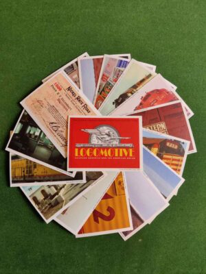
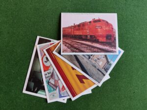